The critique last class was very informative and helped me make a decision on which logo design is going to represent Fusion. I chose to continue with the logo design that I created last semester.

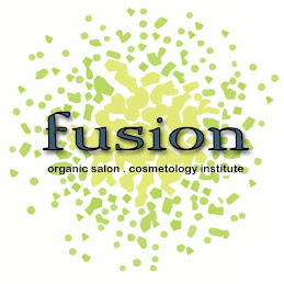
This logo represents a fun, casual place with a sophisticated edge. The yellow and green dots fusing in the logo represents that aspect of the salon and cosmetology school. It is the notion of cosmetology students "fusing" into salon professionals. Also, the arrangement of the dots form an abstract flower or plant which correlates with the whole organic aspect of the salon and school. Lastly, the graphic plays off of the word fusion. It is eye catching, contemporary, and allows something for consumers to be familiar with. This logo is going to be represented on business headers, business cards, product labels, signage, shopping bags, advertisements, etc. Once the logo design was finalized, I came up with my page layout for my capstone book which is seen below:

As you notice, the logo is placed in the upper right hand corner, so if a viewer is flipping through the book, they know that all the research and design work is for Fusion. Also, the color green in the upper right corner is for tabbing purposes. This book is going to be sectioned off into many different catagories. For each category and page that corresponds to that category will be designated with a color. The two stripes that come off of the logo is the designated place for the topic and category which pertains to that page. Lastly, the graphic on the right side corner came from a sculpture that I did for one of my sculpture classes. It is twisted metal and is signifying the design feel of the salon. Also, this is a cohesive element that is found in my professional portfolio, cover letter, resume, and business card. This is an effort to form a relationship between my capstone book and portfolio.

This logo represents a fun, casual place with a sophisticated edge. The yellow and green dots fusing in the logo represents that aspect of the salon and cosmetology school. It is the notion of cosmetology students "fusing" into salon professionals. Also, the arrangement of the dots form an abstract flower or plant which correlates with the whole organic aspect of the salon and school. Lastly, the graphic plays off of the word fusion. It is eye catching, contemporary, and allows something for consumers to be familiar with. This logo is going to be represented on business headers, business cards, product labels, signage, shopping bags, advertisements, etc. Once the logo design was finalized, I came up with my page layout for my capstone book which is seen below:

As you notice, the logo is placed in the upper right hand corner, so if a viewer is flipping through the book, they know that all the research and design work is for Fusion. Also, the color green in the upper right corner is for tabbing purposes. This book is going to be sectioned off into many different catagories. For each category and page that corresponds to that category will be designated with a color. The two stripes that come off of the logo is the designated place for the topic and category which pertains to that page. Lastly, the graphic on the right side corner came from a sculpture that I did for one of my sculpture classes. It is twisted metal and is signifying the design feel of the salon. Also, this is a cohesive element that is found in my professional portfolio, cover letter, resume, and business card. This is an effort to form a relationship between my capstone book and portfolio.


No comments:
Post a Comment